Movie Posters: Reimagined
Illustrated Movie Poster Series
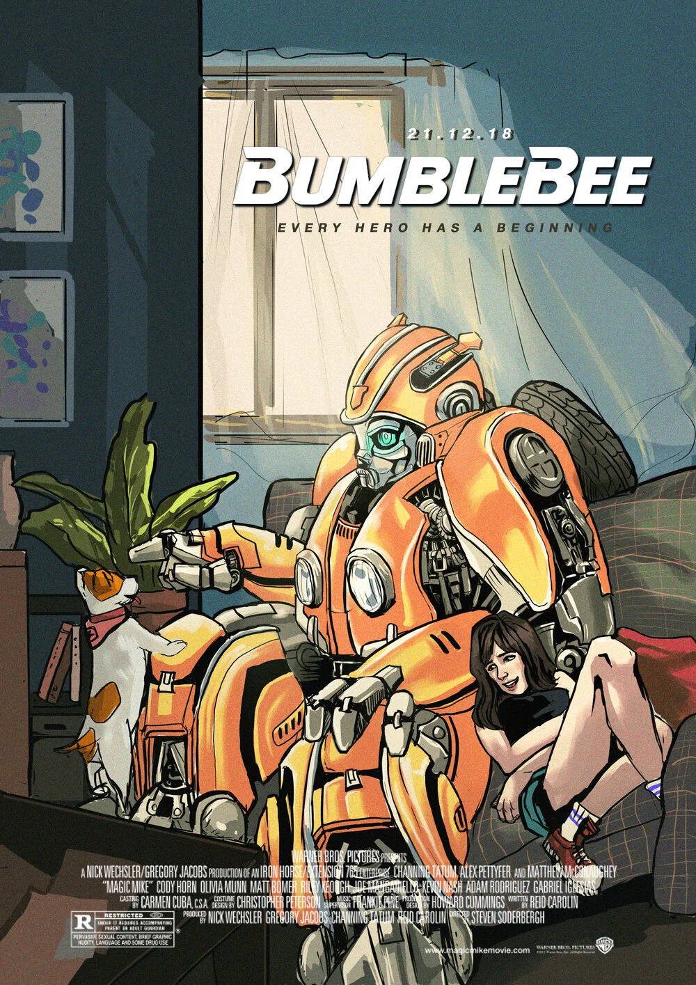
I was struck by how movie posters nowadays have started becoming stagnant and unengaging, focusing more on the big names in the film posing and staring into the distance rather than the story they were telling. I reimagined 5 of my favourite films which had rather bad posters and tried portraying what I felt was the hook of each film’s storyline.
Bumblebee (2018)
___
If you were to look up Bumblebee’s original poster, odds are you would get the one with Hailee Steinfeld and Bumblebee staring into the distance. I personally felt that what was the main draw of this movie’s storyline was the ET-esque friendship between the Bumblebee & Charlie compounded by the endearing quality of Bumblebee’s curiosity as he explored the world. I tried to bring it in the illustration which was inspired by the scene where Bee wreck’s Charlie’s house.
One Flew Over the Cuckoo’s Nest (1975)
___
Probably one of the most engaging yet uncomfortable films. The friendship between Jack Nicholson’s character McMurphy and the towering chief as they both physically & metaphorically escape the the barbed wired fences of the metal asylum remains one of the saddest yet most touching friendships of all time. At the end of the film, Chief said Mcmurphy helped him feel “as tall as a mountain.” I tried to imply that in their combined shadows; McMurphy’s ideologies & Chief’s towering height combined was finally able to breach the barbed fences. Meanwhile Nurse Ratchet, the antagonist’s shadow encroaches from the sides. The oppressive mechanisation of modern society that she represents approaching unnoticed by the two of them.
Spiderman: Far From Home (2019)
___
While I get that the posters were originally suppose to show Mystery as a good guy, every fan of the Spiderman comics would already have called it. This poster is a rehash of one of the iconic comic covers of The Amazing Spiderman Issue #311.
I think it’s a good reference that comic fans would appreciate that better describes the storyline compared to the oddly photoshopped Tom Holland & Jake Gyllenhaal staring in different directions with just Big Ben in the background of the original poster.
Hot Fuzz (2007)
___
One of my favourite films of all time, from the humour in the writing to the editing of the film, it is an insanely fun and chaotic ride which I felt the original poster did not do justice for. I think including subtle elements like the Cornetto cone (a reference to Edgar Wright’s Cornetto series of films) would be a nice reference for film lovers to catch and the swan attack being a running joke in the film would also be bewildering and random enough to pique the interests of viewers into watching.
Catch Me if you Can (2002)
___
Yet another fun film, I wanted to try another take original poster which takes itself quite literally. (Leonardo diCaprio’s character Frank running from Tom Hank’s Carl)
This time I decided to focus on the childlike immaturity of Frank while he decides to play the adult in his massive scam. There is a scene in the film where he soaks a massive amount of toy aeroplanes in a tub to remove the Panam logo from their tails to put on the cheques he receives as a deadhead.
The ideology of playing with toys in the tub is often associated with children and thus I tried to capture the essence of it juxtaposed with the oversized pilot uniform that he wears.


